Opening statement:
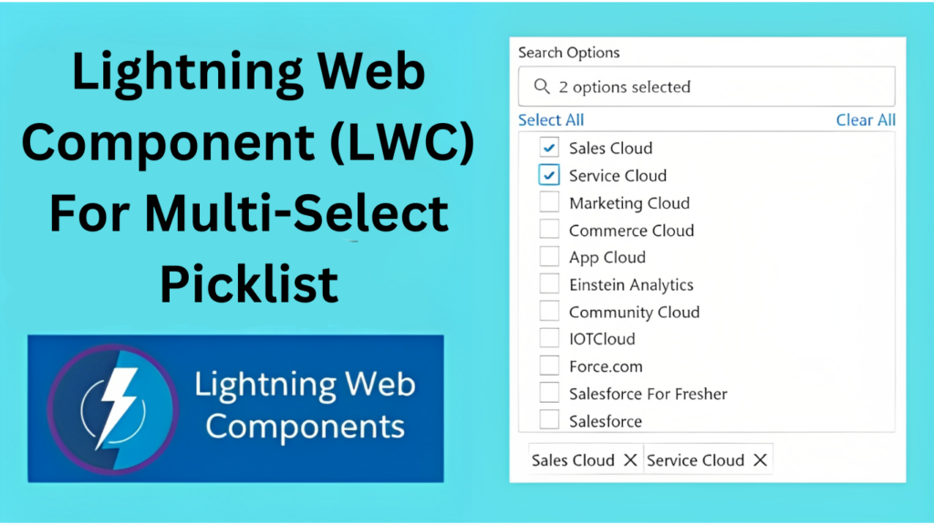
In this article, we’ll delve into the creation of a multi-select picklist component using Lightning Web Components (LWC). We will examine the code, elucidating its various sections and functionalities. The designed component empowers users to search and choose multiple items from a dropdown list, offering a convenient and user-friendly experience.
Developing a multi-select search component using Lightning Web Components enables the creation of a versatile and user-friendly interface for selecting multiple items. With capabilities like dynamic searching, intuitive selection management, and additional features such as select all and clear all, this component streamlines the selection process, elevating the overall user experience.
To begin, establish Picklist.html.
<template>
	<lightning-card>
		<div class="slds-m-left_large slds-m-right_large" onmouseleave={mousehandler}>

			<!-- Below code is for lightning input search box which will filter picklist result based on inputs given by user -->
			<lightning-input type="search" label="Search Objects" onchange={handleSearch} value={searchTerm}
				onblur={blurhandler} onfocusout={focuhandler} onclick={clickhandler} placeholder={itemcounts}>
			</lightning-input>

			<!-- Below code is for Select/Clear All function -->
			<div class="slds-grid slds-wrap">
				<template if:true={showselectall}>
					<div class="slds-col slds-large-size_10-of-12 slds-medium-size_1-of-12 slds-size_1-of-12">
						<a href="javascript.void(0)" onclick={selectall}>Select All</a>
					</div>
					<div class="slds-col slds-large-size_2-of-12 slds-medium-size_1-of-12 slds-size_1-of-12">
						<div class="slds-float_right">
							<a href="javascript.void(0)" onclick={handleclearall}>Clear All</a>
						</div>
					</div>
				</template>
				<template if:false={showselectall}>
					<div class="slds-col slds-large-size_10-of-12 slds-medium-size_1-of-12 slds-size_1-of-12">
					</div>
					<div class="slds-col slds-large-size_2-of-12 slds-medium-size_1-of-12 slds-size_1-of-12">
						<div class="slds-float_right">
							<a href="javascript.void(0)" onclick={handleclearall}>Clear All</a>
						</div>
					</div>
				</template>
			</div>

			<!-- Below code will show dropdown picklist -->
			<template if:true={showDropdown}>
				<div class="slds-box_border " style="width:100%">
					<ul class="dropdown-list slds-dropdown_length-7 slds-p-left_medium">
						<template for:each={filteredResults} for:item="profile">
							<li key={profile.Id} class="dropdown-item">
								<lightning-input type="checkbox" checked={profile.isChecked} label={profile.Name}
									value={profile.Id} onchange={handleSelection}>
								</lightning-input>
							</li>
						</template>
					</ul>
				</div>
			</template>

			<!-- Below code will show selected options from picklist in pills -->
			<div class="selection-summary">
				<div class="slds-p-around_x-small">
					<template for:each={selectedItems} for:item="selectedItem">
						<lightning-pill key={selectedItem.Id} label={selectedItem.Name} name={selectedItem.Id}
							onremove={handleRemove}></lightning-pill>
					</template>
				</div>
			</div>
		</div>
	</lightning-card>
</template>
Picklist.js Implementation
- “picklistInput” will store the values which you have to show in picklist
- “selectedItems” will store the selected values from picklist
- “selectionlimit” it is used to set upper limit of items which can be selected
import { LightningElement, track, api, wire } from 'lwc';
export default class MultiSelectSearch extends LightningElement {

    // API Variables
    @api picklistInput = ["Sales Cloud", "Service Cloud", "Marketing Cloud", "Commerce Cloud", "App Cloud", "Einstein Analytics", "Community Cloud", "IOTCloud", "Force.com", "Salesforce For Fresher", "Salesforce"];
    @api selectedItems = [];

    // Track Variables
    @track allValues = []; // this will store end result or selected values from picklist
    @track selectedObject = false;
    @track valuesVal = undefined;
    @track searchTerm = '';
    @track showDropdown = false;
    @track itemcounts = 'None Selected';
    @track selectionlimit = 10;
    @track showselectall = false;
    @track errors;
    //this function is used to show the dropdown list
    get filteredResults() {
        //copying data from parent component to local variables
        if (this.valuesVal == undefined) {
            this.valuesVal = this.picklistInput;
            //below method is used to change the input which we received from parent component
            //we need input in array form, but if it's coming in JSON Object format, then we can use below piece of code to convert object to array
            Object.keys(this.valuesVal).map(profile => {
                this.allValues.push({ Id: profile, Name: this.valuesVal[profile] });
            })

            this.valuesVal = this.allValues.sort(function (a, b) { return a.Id - b.Id });
            this.allValues = [];

            console.log('da ', JSON.stringify(this.valuesVal));
        }

        if (this.valuesVal != null && this.valuesVal.length != 0) {
            if (this.valuesVal) {
                const selectedProfileNames = this.selectedItems.map(profile => profile.Name);
                console.log('selectedProfileNames ', JSON.stringify(selectedProfileNames));
                return this.valuesVal.map(profile => {

                    //below logic is used to show check mark (✓) in dropdown checklist
                    const isChecked = selectedProfileNames.includes(profile.Id);
                    return {
                        ...profile,
                        isChecked
                    };

                }).filter(profile =>
                    profile.Id.toLowerCase().includes(this.searchTerm.toLowerCase())
                ).slice(0, 20);
            } else {
                return [];
            }
        }
    }

    //this function is used to filter/search the dropdown list based on user input
    handleSearch(event) {
        this.searchTerm = event.target.value;
        this.showDropdown = true;
        this.mouse = false;
        this.focus = false;
        this.blurred = false;
        if (this.selectedItems.length != 0) {
            if (this.selectedItems.length >= this.selectionlimit) {
                this.showDropdown = false;
            }
        }
    }

    //this function is used when user check/uncheck/selects (✓) an item in dropdown picklist
    handleSelection(event) {
        const selectedProfileId = event.target.value;
        const isChecked = event.target.checked;

        //if part will run if selected item is less than selection limit
        //else part will run if selected item is equal or more than selection limit
        if (this.selectedItems.length < this.selectionlimit) {

            //below logic is used to show check mark (✓) in dropdown checklist
            if (isChecked) {
                const selectedProfile = this.valuesVal.find(profile => profile.Id === selectedProfileId);
                if (selectedProfile) {
                    this.selectedItems = [...this.selectedItems, selectedProfile];
                    this.allValues.push(selectedProfileId);
                }
            } else {
                this.selectedItems = this.selectedItems.filter(profile => profile.Id !== selectedProfileId);
                this.allValues.splice(this.allValues.indexOf(selectedProfileId), 1);
            }
        } else {

            //below logic is used to when user select/checks (✓) an item in dropdown picklist
            if (isChecked) {
                this.showDropdown = false;
                this.errormessage();
            }
            else {
                this.selectedItems = this.selectedItems.filter(profile => profile.Id !== selectedProfileId);
                this.allValues.splice(this.allValues.indexOf(selectedProfileId), 1);
                this.errormessage();
            }
        }
        this.itemcounts = this.selectedItems.length > 0 ? `${this.selectedItems.length} options selected` : 'None Selected';

        if (this.itemcounts == 'None Selected') {
            this.selectedObject = false;
        } else {
            this.selectedObject = true;
        }
    }

    //custom function used to close/open dropdown picklist
    clickhandler(event) {
        this.mouse = false;
        this.showDropdown = true;
        this.clickHandle = true;
        this.showselectall = true;
    }

    //custom function used to close/open dropdown picklist
    mousehandler(event) {
        this.mouse = true;
        this.dropdownclose();
    }

    //custom function used to close/open dropdown picklist
    blurhandler(event) {
        this.blurred = true;
        this.dropdownclose();
    }

    //custom function used to close/open dropdown picklist
    focuhandler(event) {
        this.focus = true;
    }

    //custom function used to close/open dropdown picklist
    dropdownclose() {
        if (this.mouse == true && this.blurred == true && this.focus == true) {
            this.searchTerm = '';
            this.showDropdown = false;
            this.clickHandle = false;
        }
    }

    //this function is invoked when user deselect/remove (✓) items from dropdown picklist
    handleRemove(event) {
        const valueRemoved = event.target.name;
        this.selectedItems = this.selectedItems.filter(profile => profile.Id !== valueRemoved);
        this.allValues.splice(this.allValues.indexOf(valueRemoved), 1);
        this.itemcounts = this.selectedItems.length > 0 ? `${this.selectedItems.length} options selected` : 'None Selected';
        this.errormessage();

        if (this.itemcounts == 'None Selected') {
            this.selectedObject = false;
        } else {
            this.selectedObject = true;
        }
    }

    //this function is used to deselect/uncheck (✓) all of the items in dropdown picklist
    handleclearall(event) {
        event.preventDefault();
        this.showDropdown = false;
        this.selectedItems = [];
        this.allValues = [];
        this.itemcounts = 'None Selected';
        this.searchTerm = '';
        this.selectionlimit = 10;
        this.errormessage();
        this.selectedObject = false;
    }

    //this function is used to select/check (✓) all of the items in dropdown picklist
    selectall(event) {
        event.preventDefault();

        if (this.valuesVal == undefined) {
            this.valuesVal = this.picklistinput;

            //below method is used to change the input which we received from parent component
            //we need input in array form, but if it's coming in JSON Object format, then we can use below piece of code to convert object to array
            Object.keys(this.valuesVal).map(profile => {
                this.allValues.push({ Id: profile, Name: this.valuesVal[profile] });
            })

            this.valuesVal = this.allValues.sort(function (a, b) { return a.Id - b.Id });
            this.allValues = [];
        }
        this.selectedItems = this.valuesVal;
        this.itemcounts = this.selectedItems.length + ' options selected';
        this.selectionlimit = this.selectedItems.length + 1;
        this.allValues = [];
        this.valuesVal.map((value) => {
            for (let property in value) {
                if (property == 'Id') {
                    this.allValues.push(`${value[property]}`);
                }
            }
        });
        console.log('value of this.allValues ', JSON.stringify(this.allValues));
        this.errormessage();
        this.selectedObject = true;
    }

    //this function is used to show the custom error message when user is trying to select picklist items more than selectionlimit passed by parent component
    errormessage() {
        this.errors = {
            "Search Objects": "Maximum of " + this.selectionlimit + " items can be selected",
        };
        this.template.querySelectorAll("lightning-input").forEach(item => {
            let label = item.label;
            if (label == 'Search Objects') {

                // if selected items list crosses selection limit, it will through custom error
                if (this.selectedItems.length >= this.selectionlimit) {
                    item.setCustomValidity(this.errors[label]);
                } else {
                    //else part will clear the error
                    item.setCustomValidity("");
                }
                item.reportValidity();
            }
        });
    }
}
In conclusion, the multi-select picklist component we have developed boasts several key features that enhance usability and deliver a seamless user experience:
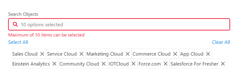
- Selection Limit: The component enables us to set a maximum limit on the number of values that can be selected from the picklist. If a user attempts to exceed this limit, an error message is displayed, ensuring adherence to the specified constraints.
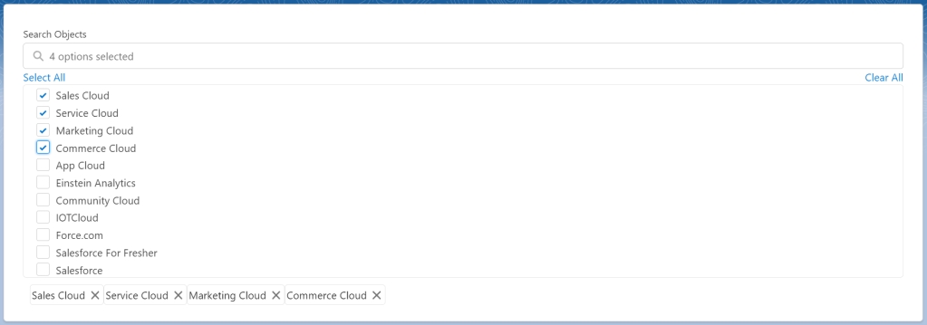
- Selected Value Pills: The component visually represents selected values as individual pills or tags. This provides users with an easy way to identify and manage their selections, allowing them to remove specific pills with a simple click.
- Search Functionality: Integrated search capability allows users to directly search for specific values within the picklist. This feature proves particularly valuable when dealing with a large number of options, facilitating quick and efficient selection.
- Checkbox Selection: Each item in the picklist is accompanied by a checkbox, allowing users to select or deselect values as needed. This intuitive checkbox functionality simplifies the selection process, providing users with granular control over their choices.
- Select All and Clear All: Convenient buttons are included to select all available values with a single click or clear all selections at once. These options save time and effort, especially when users need to work with the entire set of options or start fresh with their selections.
- Responsive Design: The picklist component is designed to be fully responsive, seamlessly integrating into different grid layouts or responsive web applications. It adapts to various screen sizes, ensuring a consistent experience across devices.
By incorporating these features, the multi-select picklist component provides a comprehensive solution for handling multiple selections in a user-friendly and efficient manner. Whether setting selection limits, offering search functionality, or allowing batch operations such as selecting all or clearing selections, this component empowers users to make informed choices and streamlines their interaction with picklist values. Its responsive design ensures compatibility with different platforms and devices, enhancing its versatility and usability across various applications.
#MultiSelectPicklist #LightningWebComponents #LWC #SalesforceDevelopment #UserExperience #FrontEndDevelopment #WebComponents #PicklistValues #CustomComponents #ResponsiveDesign #UserInterface #UXDesign #WebDevelopment #Salesforce #CodeExplained #DeveloperTips #ComponentDevelopment #salesforceforfresher #shubhamvsnv