Utilize a design resource to manage the attributes that are accessible to builder tools such as the Lightning App Builder, Community Builder, or Flow Builder. This resource resides in the same folder as your .cmp file and defines the design-time functionality of the Aura component, providing essential information for visual tools to render the component in a page or application.
Let’s illustrate this with an example.
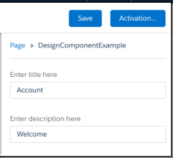
Imagine we have a component that showcases records. By employing the design resource, we can enable administrators to specify a title and description when they include the component in the Lightning page using the App Builder.
<design:component>

    <design:attribute name="title"  label="Enter title here"/>

    <design:attribute name="description"  label="Enter
                                           description here"/>

</design:component>
Component Design
The design resource serves as the foundational element, encompassing the design-time configuration for the component that tools like the App Builder can utilize.
Attribute Design
To enable administrators to modify an Aura component attribute using tools like the App Builder, include a design:attribute node for the attribute in the design resource.
If an attribute is marked as required in the component definition, it will automatically be displayed unless a default value is assigned to it.
The design resource in Lightning page interfaces exclusively accommodates attributes of types Integer, String, or Boolean.
This is what the output appears like when you incorporate the component into the page:
Note: Employing the “datasource” attribute in the design resource transforms a field into a picklist with static values. This feature is exclusively supported for String attributes.
<design:attribute name="Name" datasource="value1,value2,value3" />

You can also set the picklist values dynamically using an Apex class.
sfdc:object and sfdc:objects
Utilize these tag sets to confine your component to a single object or multiple objects.
<design:component label="Hello World">
    <design:attribute name="subject" label="Subject" description="Name of the person you want to greet" />
    <design:attribute name="greeting" label="Greeting" />

    <sfdc:objects>
        <sfdc:object>Custom__c</sfdc:object>
        <sfdc:object>Opportunity</sfdc:object>
    </sfdc:objects>

</design:component>
When an object is installed from a package, ensure to prepend the namespace__ string to the object name before including it in the sfdc:object tag set. For instance, use objectNamespace__ObjectApiName__c.