
Creating a custom Lightning Modal/Popup Box within a Salesforce Lightning component is the focus of this post.
What does Modal mean in Salesforce Lightning Experience
Modals/Popup Boxes serve to showcase content in a layer positioned above the application. This design is frequently utilized for tasks like creating or editing records, displaying various types of messages, and facilitating wizards.
The Salesforce Lightning Component for Modal/Popup appears as depicted in the image below.
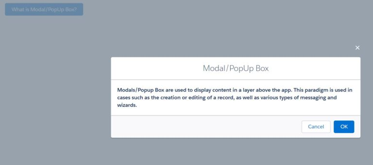
Lightning Component ModalPopupExample1
This code initially declares the ‘isModalOpen’ attribute and sets its default value as false. Subsequently, using aura:if, it conditionally displays the modal/popup upon clicking the button.
The code contains three primary parts:
- Section
- Header
- Footer
The details regarding these parts are elaborated within the code comments.
The expected markup is as follows:
Anticipated markup within the modal popup
The modal includes a role=”dialog”. When the modal is open, elements behind it use the HTML attribute aria-hidden=”true” to prevent assistive technology from reading the underlying page. An effective approach involves assigning separate wrapper elements to the modal and the page, toggling aria-hidden=”true”/aria-hidden=”false” on the main page’s wrapper based on the modal’s open/close state. The modal comprises an HTML heading. It possesses an aria-labelledby attribute with its value set as the ID of the modal’s heading.
<aura:component>
    <!--Boolean attribute to indicate if modal is open or not
       default value is false as modal is closed when page is loaded
    -->
    <aura:attribute name="isModalOpen" type="boolean" default="false"/>

    <div class="slds-m-around_xx-large">
        <lightning:button variant="brand"
                          label="What is Modal/PopUp Box?"
                          title="What is Modal/PopUp Box?"
                          onclick="{! c.openModel }" />
        <!--Use aura:if tag to display/hide popup based on isModalOpen value-->
        <aura:if isTrue="{!v.isModalOpen}">

            <!-- Modal/Popup Box starts here-->
            <section role="dialog" tabindex="-1" aria-labelledby="modal-heading-01" aria-modal="true" aria-describedby="modal-content-id-1" class="slds-modal slds-fade-in-open">
                <div class="slds-modal__container">
                    <!-- Modal/Popup Box Header Starts here-->
                    <header class="slds-modal__header">
                        <lightning:buttonIcon iconName="utility:close"
                                              onclick="{! c.closeModel }"
                                              alternativeText="close"
                                              variant="bare-inverse"
                                              class="slds-modal__close"/>
                        <h2 id="modal-heading-01" class="slds-text-heading_medium slds-hyphenate">Modal/PopUp Box</h2>
                    </header>
                    <!--Modal/Popup Box Body Starts here-->
                    <div class="slds-modal__content slds-p-around_medium" id="modal-content-id-1">
                        <p><b>Modals/Popup Box are used to display content in a layer above the app. This paradigm is used in cases such as the creation or editing of a record, as well as various types of messaging and wizards.
                            </b>
                        </p>
                    </div>
                    <!--Modal/Popup Box Footer Starts here-->
                    <footer class="slds-modal__footer">
                        <lightning:button variant="neutral"
                                          label="Cancel"
                                          title="Cancel"
                                          onclick="{! c.closeModel }"/>
                        <lightning:button variant="brand"
                                          label="OK"
                                          title="OK"
                                          onclick="{!c.submitDetails}"/>
                    </footer>
                </div>
            </section>
            <div class="slds-backdrop slds-backdrop_open"></div>
        </aura:if>
    </div>
</aura:component>
Apex Controller for Lightning Component
({
   openModel: function(component, event, helper) {
      // Set isModalOpen attribute to true
      component.set("v.isModalOpen", true);
   },

   closeModel: function(component, event, helper) {
      // Set isModalOpen attribute to false
      component.set("v.isModalOpen", false);
   },

   submitDetails: function(component, event, helper) {
      // Set isModalOpen attribute to false
      //Add your code to call apex method or do some processing
      component.set("v.isModalOpen", false);
   },
})
Lightning Component Application: ModalPopupExampleApp1
<aura:application extends="force:slds">
    <c:ModalPopupExample1/>
</aura:application>
Certainly, more information about the Lightning modal/popup can be found in various Salesforce documentation and resources.
Modals consistently maintain an equivalent amount of space at both the top and bottom to accommodate the close button’s height.
The modals expand based on the content within them. However, when the modal reaches its full height, including the aforementioned top and bottom space, the content area will start to scroll. (Note: This scrolling feature is currently not available in Salesforce1 Mobile.)
For additional information on modals in Lightning, please consult the following resource: modal lightning