
Currently, it is possible to customize CSS for standard Lightning Base Components using styling hooks.
What are Styling Hooks
Styling hooks leverage CSS custom properties, simplifying the process of customizing component styling. By using CSS custom properties as hooks, we can easily personalize the SLDS (Salesforce Lightning Design System) component with our desired style.
Where can I locate Styling Hooks?
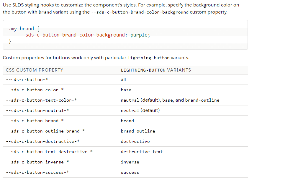
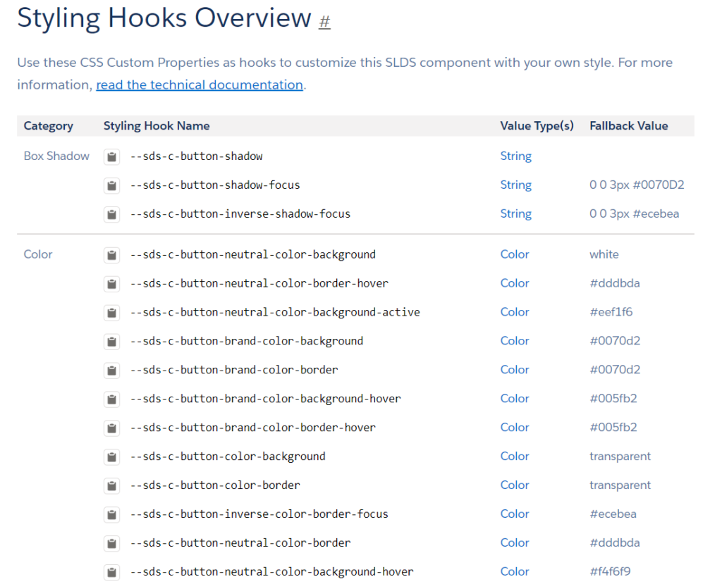
Styling hooks for base Lightning components can be found on the SLDS website. To access the styling hooks for a specific component, such as “lightning-button,” navigate to the Lightning Component Library. In the documentation section, look for the “Customize Component Styling” section. There, you will find the styling hooks available for that particular component, as demonstrated below.
What does a Styling Hook appear like?
--sds-c-button-brand-color-background : violet;
How to utilize Styling Hooks?
Styling hooks offer various applications; consider the example below for illustration.
<template>
	<lightning-button class="button" variant="brand" label="Custom" title="custom"></lightning-button>
</template>
lightning-button.button {
--sds-c-button-brand-color-background: #bb00ff;
--sds-c-button-text-color: #f4f7f9;
}In the given example, my objective is to change the color of the lightning-button to violet.
For further insights into styling hooks, you can explore the following reference links: