
Styling hooks became generally available in the Spring ’22 release, introducing a new realm of customization possibilities for Lightning base components and beyond.
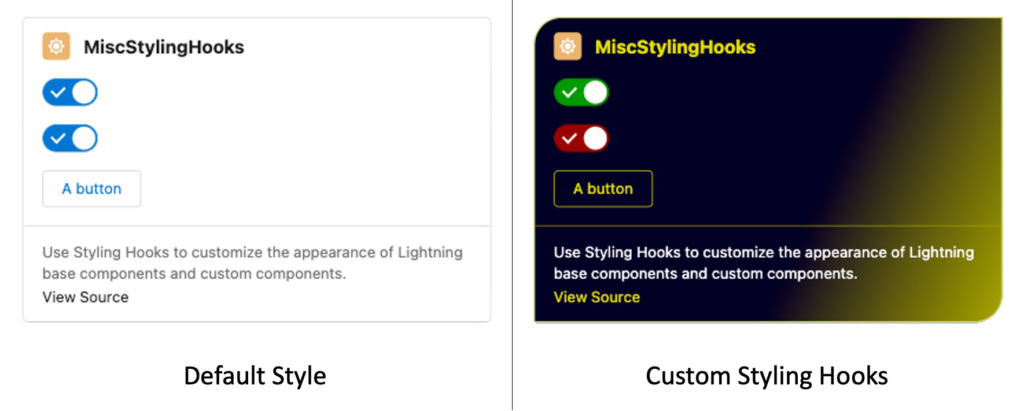
Styling hooks reached General Availability in the Spring ’22 release, and this enhancement paves the way for extensive customization of Lightning base components and beyond. Leveraging styling hooks, you can effortlessly transform the look and feel of a standard user interface with just a few lines of CSS:
In this article, we won’t delve into personal preferences and aesthetics, but we will delve into the concepts of CSS custom properties and styling hooks, and explore how you can harness them to customize the appearance of Lightning base components and construct components that are both themeable and reusable. We will walk through a styling hook recipe from the LWC Recipes example application as a demonstration. And, as a final highlight, you’ll also have the opportunity to engage in our LWC Style Challenge!
CSS Custom Properties and Styling Hooks Overview
Before delving into Salesforce-specific elements, let’s take a step back and discuss fundamental web standards.
When creating a web component-based application, we enjoy the advantages of encapsulation, primarily due to theShadow DOM.
This implies that the CSS for each component remains self-contained, preventing any unintended style interference between components. Nonetheless, this behavior is in contrast to the conventional use of CSS, where styles cascade (as the name suggests) down the component hierarchy. Style inheritance forms the basis for constructing comprehensive design systems, so when working with web components, an alternative approach is required.
This is where CSS custom propertiesCustom properties, also known as CSS variables, play a vital role in this context. In contrast to regular CSS rules, custom properties traverse the Shadow DOM boundaries, enabling you to share styling elements among web components. This makes them a valuable resource for achieving consistent customization of web components.
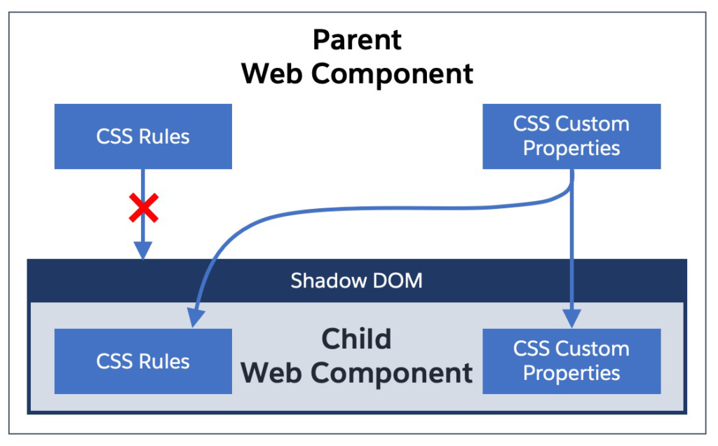
With this capability, there’s no longer a necessity to depend on a mix of HTML attributes and JavaScript for the dynamic configuration of the style for child web components.
Utilizing custom properties is a straightforward process. You define them in a manner similar to a standard attribute within a CSS rule, but with the addition of a double dash prefix (–). For instance, in the code below, a “main text color” property is declared as red in a rule featuring the :host selector:
:host {
    --main-text-color: blue;
}
We can subsequently access the value of our custom property by utilizing the var() function (refer to the code snippet below for an example):docs):
p {
   color: var(--main-text-color); /* blue */
}
Returning to the context of the Salesforce ecosystem, styling hooks encompass a collection of CSS custom properties made accessible by the Lightning Design System (LDS)component templates. In essence, styling hooks are employed to tailor the Lightning base componentsand personalized components utilizing LDS.
Customizing Lightning Base Components
The majority of Lightning base components provide a range of styling hooks that empower you to override certain aspects of their styling. While not every style attribute can be customized, the catalog of available hooks expands with each Salesforce release.
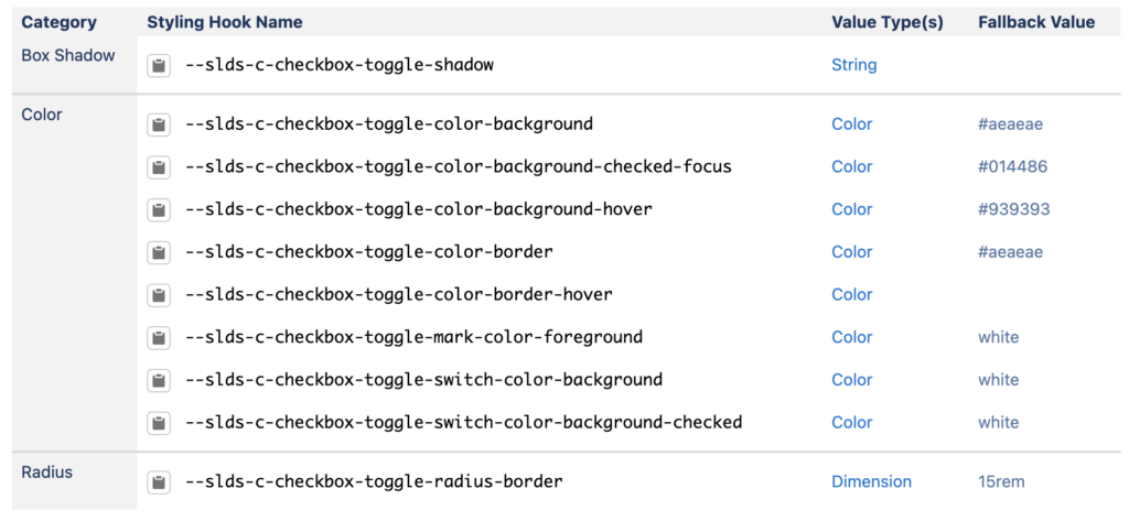
As an illustration, consider the checkbox toggle component. Reviewing the documentation For this component’s blueprint, we can examine a summary of the available styling hooks:
To customize this toggle, you simply need to override some of these styling hooks in the CSS of a parent component:
/* CSS of a parent LWC that hosts a lightning-input base component */
:host {
  --sds-c-checkbox-toggle-color-border-checked: #009900;
  --sds-c-checkbox-toggle-color-background-checked: #009900;
  --sds-c-checkbox-toggle-color-background-checked-focus: #00cc00;
}
Please note: that in LWC code, the slds styling hook prefix in the blueprint documentation is transformed into sds.
With just these few lines of CSS, you can transform a regular blue toggle into a green one:

Styling hooks and custom CSS properties extend beyond base components, allowing you to harness their capabilities in the creation and distribution of themeable and reusable components.
Constructing Components That Are Both Themeable and Reusable
Much like Lightning base components, you have the capability to develop components that are themeable and reusable, all thanks to CSS custom properties. The crucial aspect here lies in your capacity to specify a fallback value as a second argument when employing the var function to fetch custom property values.
As an illustration, consider this snippet of code derived from the viewSource component:(see source) within LWC Recipes provides the opportunity to customize the text color within a recipe’s description.
.description {
    /* Use custom property with a fallback value */
    color: var(--source-text-color, #706e6b);
}
By default, the description text is set to grey. However, if a parent component of viewSource specifies a –source-text-color custom property, the value of this property will take precedence over the default text color (the fallback value).
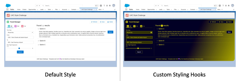
When creating your own theme, adhere to the pattern we illustrated in the preceding example:styling hooks recipe:
Define foundational custom properties at the root of your parent component. Override styling hooks from base components and child components with your custom properties. As a best practice, whenever feasible, employ your foundational custom properties in your CSS rules instead of directly embedding specific values.
To see this in action, let’s begin by establishing some variables for our theme. In our scenario, we have primary and secondary colors, each with alternate shades:
:host { /* Custom CSS properties for reusing style in this component and child components */ --primary-color: #e3df00; --primary-color-alt-shade: #a7a400; --secondary-color: #020024; --secondary-color-alt-shade: #343304; /* ... */ }
Following this, we utilize our custom properties to override styling hooks for the child component, whether it’s a base component such as a Lightning card or a custom component like viewSource:
:host {
  /* ... */

  /* Lightning card styling hooks */
  --sds-c-card-color-background: linear-gradient(
    115deg,
    var(--secondary-color) 60%,
    var(--primary-color-alt-shade) 100%
  );
  --sds-c-card-text-color: var(--primary-color);
  --sds-c-card-radius-border: 1.5rem 0;
  --sds-c-card-color-border: var(--primary-color);
  --sds-c-card-footer-color-border: var(--primary-color-alt-shade);

  /* ... */

  /* View source component styling hooks */
  --source-text-color: #ffffff;
  --source-link-color: var(--primary-color);
  --source-link-color-hover: var(--primary-color-alt-shade);
}
Concluding Thoughts and Challenge
That wraps up our exploration of CSS custom properties and styling hooks. You now have a solid understanding of how they function and their significance in customizing Lightning Web Components. You’ve witnessed their application in the customization of Lightning base components and the creation of your own reusable, themeable custom components. Don’t forget to check out the LWC Recipess ample application for a practical demonstration.
LWC Style Challenge
Let’s engage in a friendly challenge: share a screenshot showcasing your most impressive style customization of theLWC Style Challenge application utilizing the#LWCStyleChallengehashtag on Twitter or LinkedIn by July 31st. We will evaluate the submissions and share the most outstanding contributions. Show off your creativity and dazzle us with your CSS talents!
Additional Information
- Styling hook example in LWC Recipes
- Podcast episode: SLDS and Styling Hooks with Brandon Ferrua
- Styling hooks guide in the Lightning Design System component blueprints
- Documentation for customizing LWC in the LWC Developer Guide
- Utilizing CSS custom properties (variables) in MDN