
Toast messages in LWC (Lightning Web Components) allow for the notification of success, error, warning, or simple information. To showcase a toast notification within Lightning Experience or Lightning communities, the ShowToastEvent needs to be imported from the lightning/platformShowToastEvent module. Dispatching this toast can be triggered by an event, such as a button click.
Adding a toast message in a Lightning Web Component (LWC)
Importing Toast Message
import { ShowToastEvent } from 'lightning/platformShowToastEvent';
Triggering Toast Message
showToast() {
    const event = new ShowToastEvent({
        title: 'Toast message',
        message: 'Toast Message',
        variant: 'success',
        mode: 'dismissable'
    });
    this.dispatchEvent(event);
}
Here are some key points about toast messages:
- The mode parameter allows us to style the toast to display error, success, warning, and information messages.
- The ‘variant’ attribute also allows configuration of the toast’s visibility—whether it remains visible for three seconds, until the user dismisses it by clicking, or a combination of both.
- To initiate a toast from a Lightning web component’s JavaScript class, import ‘ShowToastEvent’ from ‘lightning/platformShowToastEvent’.
- Generate a ShowToastEvent by defining several parameters, and then dispatch it.
Varieties of toast messages in Lightning Web Components LWC
Error Message Toast
showErrorToast() {
    const evt = new ShowToastEvent({
        title: 'Toast Error',
        message: 'Some unexpected error',
        variant: 'error',
        mode: 'dismissable'
    });
    this.dispatchEvent(evt);
}
Success Message Toast
showSuccessToast() {
    const evt = new ShowToastEvent({
        title: 'Toast Success',
        message: 'Opearion sucessful',
        variant: 'success',
        mode: 'dismissable'
    });
    this.dispatchEvent(evt);
}
Warning Message Toast
showWarningToast() {
    const evt = new ShowToastEvent({
        title: 'Toast Warning',
        message: 'Some problem',
        variant: 'warning',
        mode: 'dismissable'
    });
    this.dispatchEvent(evt);
}
Information Message Toast
showInfoToast() {
    const evt = new ShowToastEvent({
        title: 'Toast Info',
        message: 'Operation will run in background',
        variant: 'info',
        mode: 'dismissable'
    });
    this.dispatchEvent(evt);
}
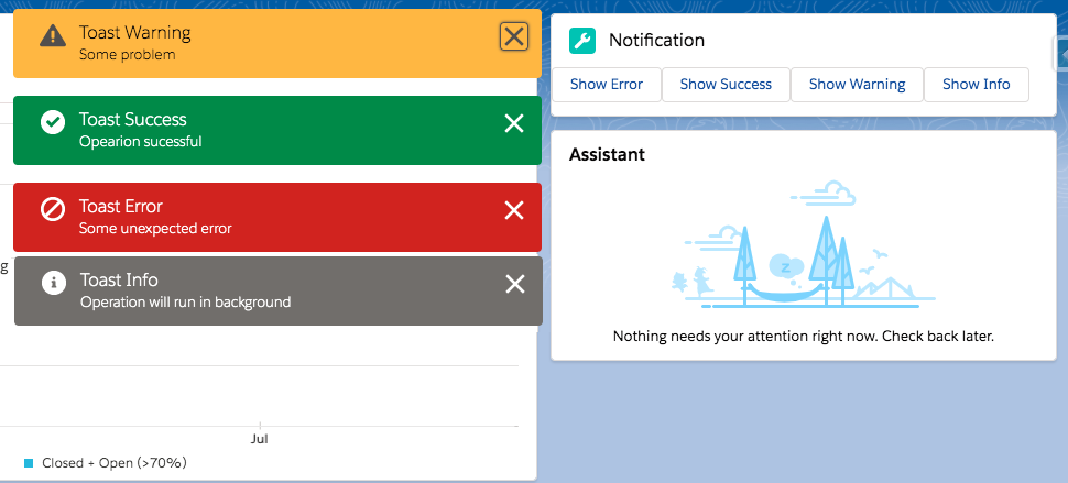
Example of Lightning Web Component LWC Toast Messages
toastNotificationExampleLWC.html
<template>
    <lightning-card title="Notification" icon-name="custom:custom19">
        <lightning-button label="Show Error" onclick={showErrorToast}></lightning-button>
        <lightning-button label="Show Success" onclick={showSuccessToast}></lightning-button>
        <lightning-button label="Show Warning" onclick={showWarningToast}></lightning-button>
        <lightning-button label="Show Info" onclick={showInfoToast}></lightning-button>
    </lightning-card>
</template>
toastNotificationExampleLWC.js
import { LightningElement } from 'lwc';
import { ShowToastEvent } from 'lightning/platformShowToastEvent';
export default class ToastNotificationExampleLWC extends LightningElement {
    showErrorToast() {
        const evt = new ShowToastEvent({
            title: 'Toast Error',
            message: 'Some unexpected error',
            variant: 'error',
            mode: 'dismissable'
        });
        this.dispatchEvent(evt);
    }
    showSuccessToast() {
        const evt = new ShowToastEvent({
            title: 'Toast Success',
            message: 'Opearion sucessful',
            variant: 'success',
            mode: 'dismissable'
        });
        this.dispatchEvent(evt);
    }
    showWarningToast() {
        const evt = new ShowToastEvent({
            title: 'Toast Warning',
            message: 'Some problem',
            variant: 'warning',
            mode: 'dismissable'
        });
        this.dispatchEvent(evt);
    }
    showInfoToast() {
        const evt = new ShowToastEvent({
            title: 'Toast Info',
            message: 'Operation will run in background',
            variant: 'info',
            mode: 'dismissable'
        });
        this.dispatchEvent(evt);
    }
}
toastNotificationExampleLWC.js-meta.xml
<?xml version="1.0" encoding="UTF-8"?>
<LightningComponentBundle xmlns="http://soap.sforce.com/2006/04/metadata">
    <apiVersion>48.0</apiVersion>
    <isExposed>true</isExposed>
    <targets>
        <target>lightning__AppPage</target>
        <target>lightning__RecordPage</target>
        <target>lightning__HomePage</target>
    </targets>
</LightningComponentBundle>
Now, we can incorporate this LWC component onto the home page.
- Navigate to the Home page.
- Click on Setup (Gear Icon) and choose Edit Page.
- In the Custom Components section, locate your toastNotificationExampleLWC component and drag it to the top right-hand side.
- Save the changes and activate them.
The output will be as follows:
Below is a list of Toast Event Parameters:
| PARAMETER | TYPE | DESCRIPTION |
|---|---|---|
| title | String | The title of the toast, displayed as a heading. |
| message | String | A string containing a message for the user. |
| messageData | String[] or Object | url and label values that replace the {index} placeholders in the message string. |
| variant | String | The theme and icon displayed in the toast. Valid values are: info—(Default) A gray box with an info icon. success—A green box with a checkmark icon. warning—A yellow box with a warning icon. error—A red box with an error icon. |
| mode | String | Determines how persistent the toast is. Valid values are: dismissable—(Default) Remains visible until the user clicks the close button or 3 seconds has elapsed, whichever comes first. pester—Remains visible for 3 seconds. sticky—Remains visible until the user clicks the close button. |
For further details, please consult the following official link.