
Craft Your HTML Component
You have the option to utilize platforms like codepen.io for this purpose if you require a custom design, or it’s also an excellent resource for finding boilerplate code that you can customize to fit your needs.
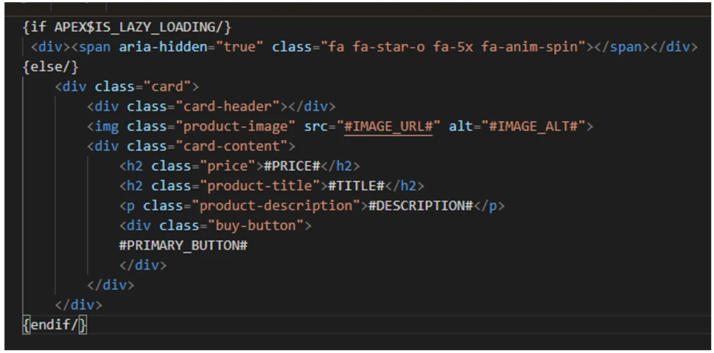
Here’s an example I crafted for our card design:
<div class="card">
  <div class="card-header"></div>
  <img class="product-image" src="#IMAGE_URL#" alt="#IMAGE_ALT#">
  <div class="card-content">
    <h2 class="price">#PRICE#</h2>
    <h2 class="product-title">#TITLE#</h2>
    <p class="product-description">#DESCRIPTION#</p>
    <div class="buy-button">#PRIMARY_BUTTON#</div>
  </div>
</div>
You’ll observe the incorporation of APEX substitution strings, which enable our components to remain dynamic.
Next, I passed this HTML code to an AI tool (specifically, I used Bard for this task) and requested it to generate the CSS for styling using the Google Material Theme. It promptly provided the CSS, and with some minor adjustments in codepen, we now have the CSS for our basic card.
/* Google Material Theme Colors */
:root {
    --primary-color: #2196F3;
    --accent-color: #FF5722;
}

/* Reset some default styles */
/* Card Container */

.card-container {
  width: 100%;
  flex-wrap: wrap;
  display: flex;
  align-items: center;
  justify-content: flex-start;
}

.card {
    min-height: 220px;
    max-width: 350px;
    position: relative;
    background-color: white;
    border-radius: 8px;
    box-shadow: 0px 4px 6px rgba(0, 0, 0, 0.1);
    margin: 20px;
}

/* Card Header */
.card-header {
    background-color: var(--primary-color);
    color: white;
    padding: 12px;
    text-align: center;
    border-top-left-radius: 8px;
    border-top-right-radius: 8px;
}

/* Product Image */
.product-image {
    padding: 1em;
    /* max-width: 100%; */
    height: 250px;
    width: 230px;
    display: block;
    border-radius: 8px 8px 0 0;
}

/* Card Content */
.card-content {
    padding: 16px;
    color: black;
}

/* Product Title */
.product-title {
    font-size: 20px;
    font-weight: 500;
    margin-bottom: 8px;
    color: black;
}

/* Product Description */
.product-description {
    font-size: 14px;
    color: #666;
    margin-bottom: 16px;
}

/* Buy Button */
.buy-button {
    display: block;
    background-color: var(--accent-color);
    color: white;
    text-align: center;
    padding: 10px;
    border: none;
    border-radius: 4px;
    cursor: pointer;
    transition: background-color 0.2s;
    text-decoration: none;
}

.buy-button:hover {
    background-color: #E64A19;
}

.card:hover {
  transform: translateY(-5px);
  box-shadow: 0px 2px 4px rgba(0, 0, 0, 0.2);
}
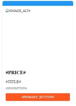
Here’s the card that resulted:
Build the Template Component in APEX
Now that we have the HTML and CSS for our component, the next step is to create a plugin using our code.
Within your application, navigate to Shared Components -> Plugins -> Create -> From Scratch. Enter the name and set the template to Multiple (Report). Some code will be generated, providing examples of template directives for added flexibility. You can find more information on template directives [here](link to more info on template directives). I’ve removed the directives except for lazy loading options, where I’ve added the spinner and our card HTML code.
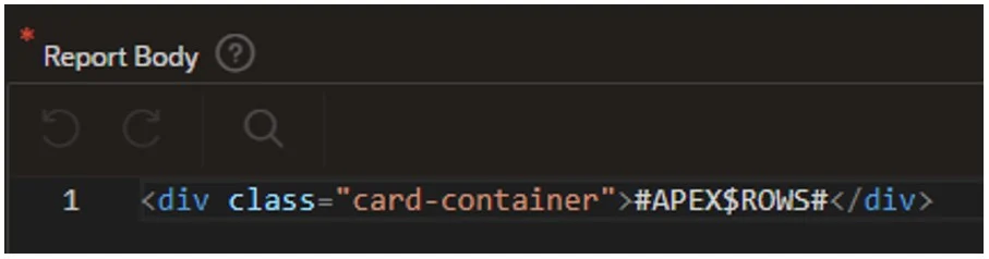
In the Report Body section, include a container with the substitution string for the rows:
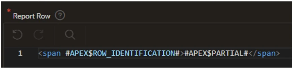
In the Report Row section:
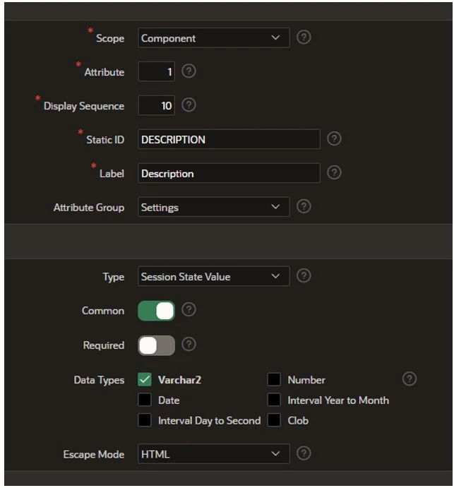
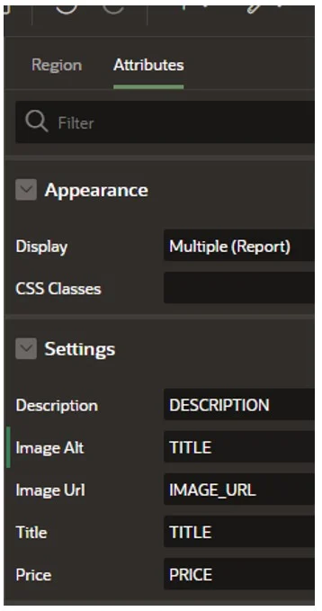
- Now, select “Create Plug-in.” The substitution strings we integrated into the HTML have been established as custom attributes with their respective static identifiers.
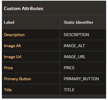
You can choose these to modify the settings of each as needed:
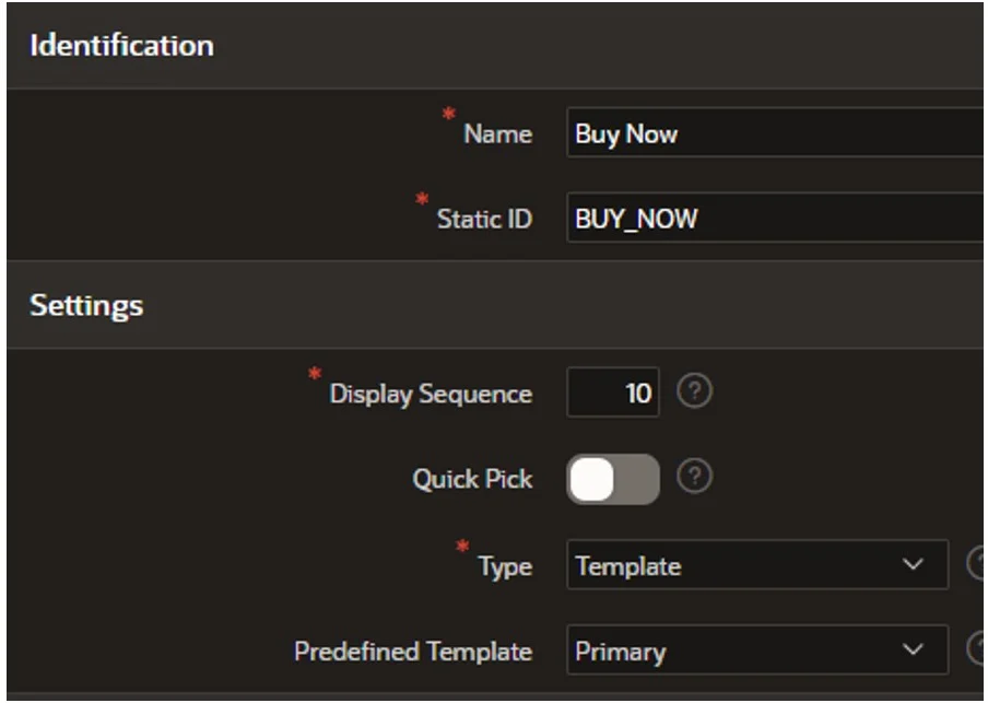
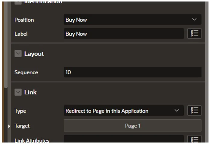
Following that, let’s include the ‘Buy Now’ button for our product card.
- Opt for ‘Add Action Template’. Here, we’ll establish a template for our button to utilize.

This will generate template HTML for us.
- Now choose ‘Add Action Position’, fill in the details, and click ‘Create’:
- To add our CSS, click on ‘Create File’ in the Files section. Provide a suitable name for your file and then click ‘Create’.
Now, paste the CSS code into the file and save the changes.
Incorporate the Template Component into a page within your application
Our component is now prepared for use! Let’s witness it in action.
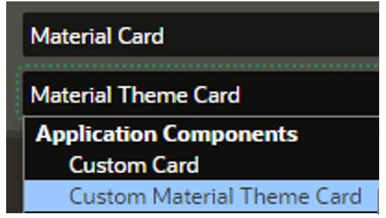
- Begin by creating a new blank page within the application. Add a new region, and you’ll observe the name of our freshly crafted component listed under the Application Components section.
- As for the source, you can select from the standard options. In this case, we’ll opt for an SQL query to populate our substitution string values. For this demonstration, I’ve simply utilized dummy data (an example of a couple of rows is provided below):
select 'Samsung S23' TITLE,
       '£975.00' PRICE,
       '#APP_FILES#s23.jpg' IMAGE_URL,
       'Plus Cell Phone, Factory Unlocked Android Smartphone, 256GB, 50MP Camera, Night Mode, Long Battery Life, Adaptive Display, US Version, 2023, Green' DESCRIPTION
from dual
union
select 'Z-Fold' TITLE,
       '£1075.00' PRICE,
       '#APP_FILES#fold.jpg' IMAGE_URL,
       'Foldable Cell Phone, Factory Unlocked Android Smartphone, 256GB, 50MP Camera, Night Mode, Long Battery Life, Adaptive Display, US Version, 2023, Green' DESCRIPTION
from dual
- Following that, we need to map the columns:
- The last step involves adding the ‘Buy Now’ button – simply right-click Actions and select “Add”:
We could have included a Custom attribute for a URL for each item and filled it in the query. However, for the demonstration, I’m simply linking to a page within my application.
The Outcome
All that’s left to do is run our page:
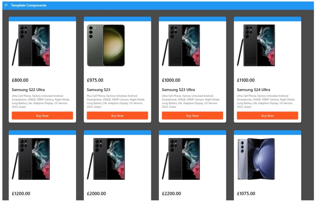
We now have a fully responsive cards region using our newly created template component!
Summary
In the dynamic realm of Oracle APEX development, the debut of Template Components in version 23.1 represents a monumental leap forward. This functionality equips developers with the tools to effortlessly craft and distribute fully declarative UI components within the APEX environment. The incorporation of template directives further enhances the scope for customization, reflecting the collaborative spirit of the APEX community. With platforms like apex.world nurturing a culture of knowledge sharing, developers are empowered to contribute to collective progress. As we embark on this era of collaborative innovation, Template Components epitomize the boundless opportunities within Oracle APEX, encouraging developers to create, share, and enhance the APEX ecosystem collectively.